1
\$\begingroup\$

Am I the only person that still accesses this site on a large enough monitor (with a non-metered internet connection) that prefers images that fill the column width to downsized versions that look like postage stamps on a 27" 2K monitor?

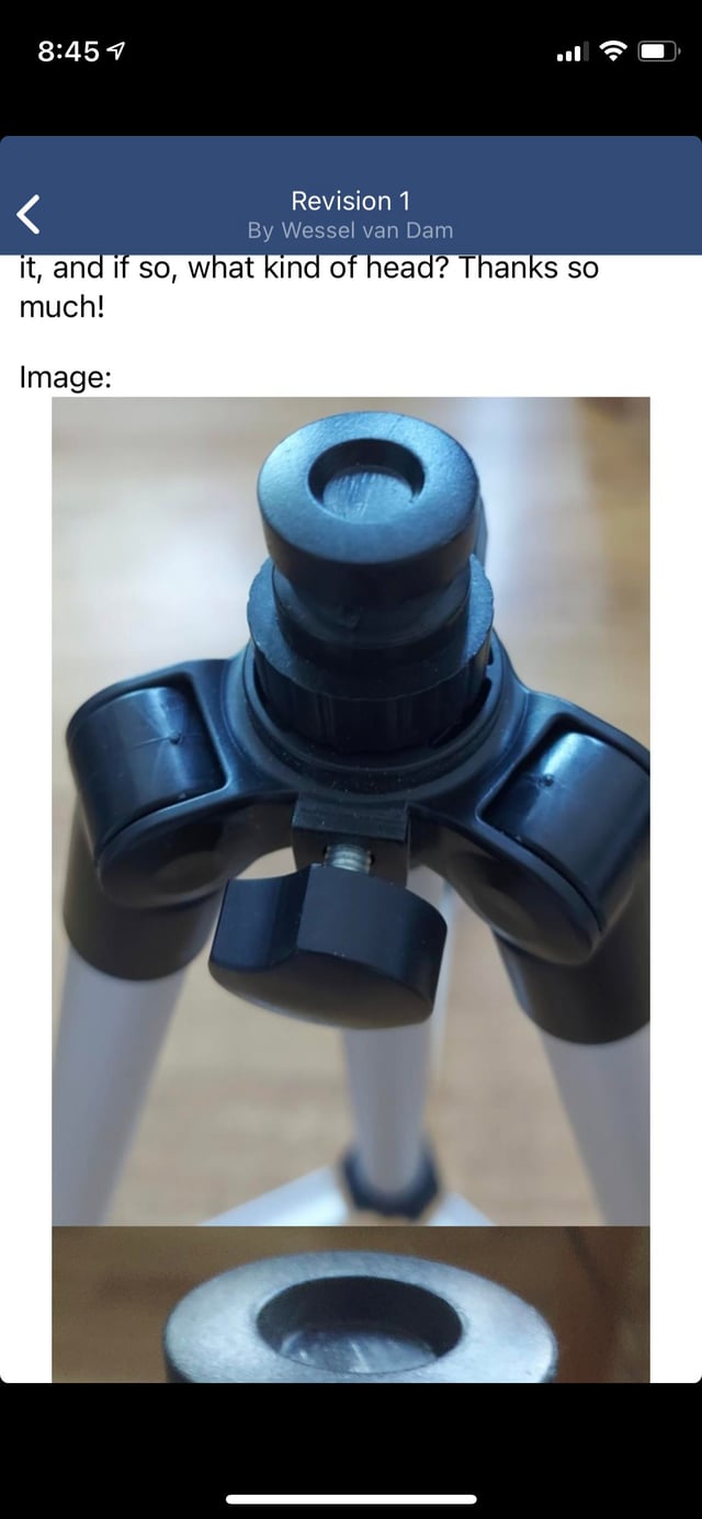
Specifically: This question included images provided by the OP that filled the width of the text column as displayed on my desktop using the Chrome browser. I thought it looked pretty good the way the O.P. posted it.

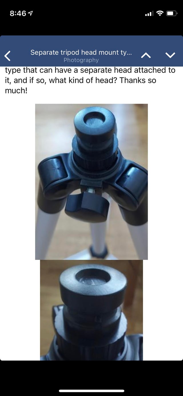
Later, another user reduced the size of the images to previews that look like postage stamps when the question is viewed via the setup I'm using.
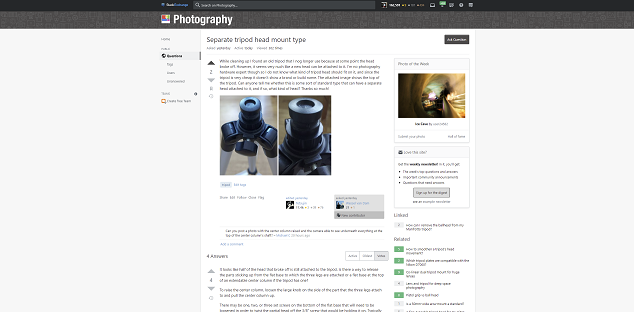
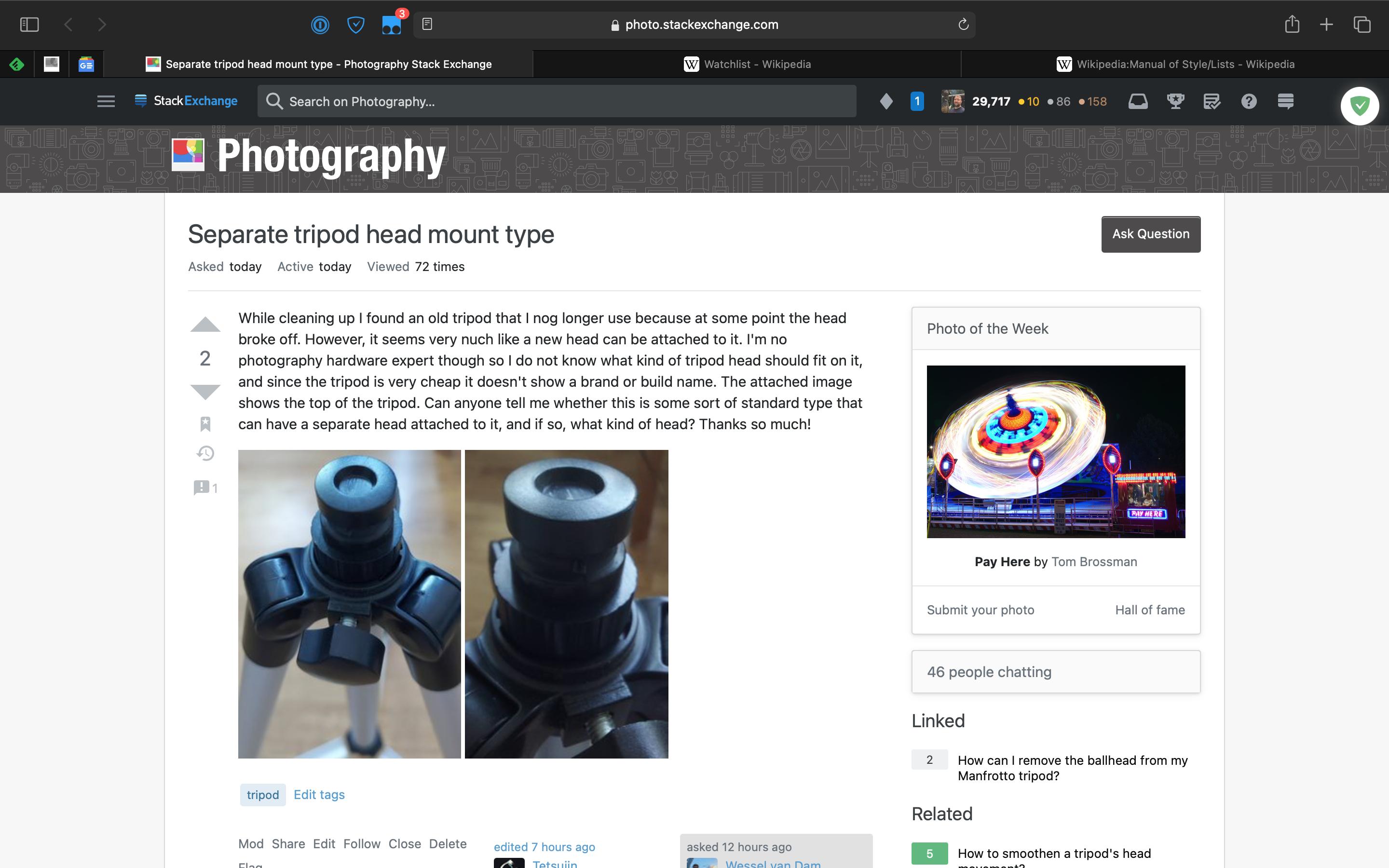
enter image description here
This isn't even quite the full width of my monitor, and I've cropped out the browser tabs and task bar at the top and bottom.

Is everyone else here using their phone or other smaller screen device on metered connections to use the site? Or are do most users use a laptop or desktop with a larger screen and an internet connection that doesn't charge by the kilobyte?

\$\endgroup\$

1 Answer 1

2
\$\begingroup\$

Personally, I find portrait-oriented large images are way too large on Stack Exchange. For posts such as the one in question, where the images are functional and uninteresting (rather than artistic, actual photographic effort), two large images in series make the text seem incidental to the HUGE photo list that cause lots of scrolling (at least on my laptop screen). For such posts, I'm happier to see a couple smaller images side-by-side as they were edited, linked to the full-size images to view if necessary:

enter image description here

However, on mobile, the edit makes the layout look slightly worse. Below are screenshots of the post as viewed in the Stack Exchange mobile app on my phone. Original (full size images) first, as-edited second:

original layout on mobile enter image description here

Regarding your last question, for me it's not a strict either-or (mobile & metered vs. desktop/laptop w/ fast unmetered). My use-case is all platforms: I use either the mobile app or a laptop to check in on the site when I'm out and about (and use the responsive-design desktop site in my phone's browser to do any posting that requires editing if my laptop isn't convenient), and a desktop with large monitor when at home. I am not on a metered connection.

But for viewing on desktop or laptop, I prefer smaller images in posts (if they're portrait-oriented) side-by-side, over full column-width one.

\$\endgroup\$
5
  • \$\begingroup\$ Please see the screenshot I've added to the OP. I don't get near that much width as a percentage of monitor width on a 2K (2560x1440) monitor. \$\endgroup\$
    – Michael C
    Commented Jun 28, 2021 at 20:45
  • \$\begingroup\$ @MichaelC My laptop's screen is 13" diagonal, so Stack Exchange's layout fills my full-screen browser pretty well. When I'm on my 27" desktop, my browser is snapped to either 50% left or right. But proportionally-speaking, the width of the content column on SE appears to be the same on your screen as it is on my laptop. \$\endgroup\$
    – scottbb Mod
    Commented Jun 29, 2021 at 2:15
  • 2
    \$\begingroup\$ @MichaelC I still prefer somewhat smaller images in most posts. But I'll grant that in this case, I would prefer the pair of images side-by-side fill the full width of the content area. Loks like they could stand to be about 50% wider. \$\endgroup\$
    – scottbb Mod
    Commented Jun 29, 2021 at 2:17
  • 1
    \$\begingroup\$ I understand different folks view the site on different types of devices. Thus this question. I usually have Chrome set to magnify all pages on the SE network at 125% (That's one nice thing about Chrome, you can customize the display for individual domains without it affecting the way pages from other domains are loaded.), but it's still a bit small. \$\endgroup\$
    – Michael C
    Commented Jun 29, 2021 at 17:00
  • 1
    \$\begingroup\$ As I was the one who inlined the imgur m images on that - my thoughts are similar to scotttbb's. I am more likely to do this if it's portrait. If it's a huge shot of a bit of 'tech' I prefer to click through if I need to see it larger. If it's 'artistic' I quite like them larger initially, because of the impact. I guess it would be nice if 'responsive design' could be responsive to a pref, but I guess that's a bridge too far. I do tend to click through even on larger images, to see as much detail as I can in a solo page, & often even drag them into photoshop if I really want to peek them. \$\endgroup\$
    – Tetsujin
    Commented Jul 15, 2021 at 16:49

You must log in to answer this question.

Not the answer you're looking for? Browse other questions tagged .