13
\$\begingroup\$

Hi all. I'm Jin and I'll be working on the designs for the Stack Exchange sites as they graduate from the beta phase. Each site will have its own unique theme that will reflect its topic. However, all sites will share quite a bit of common elements so they feel like they're part of the Stack Exchange family.

I'll be honest, the design for Photography has been a tough one for me. For one, there are many styles in photography and so many different gear choices. My original idea was using the typical graphics of camera lenses, aperture blades, film strips etc, or even some heavy Web2.0 elements. Unfortunately, the design became very cluttered and overwhelmed the content.

I then turned to print photography magazines for inspiration. One common design theme I found was minimalism. The clean design really accentuated the vibrant photos. On our site , the content isn't photos but quality questions and answers, which are text. In order to pull off a minimalist design without looking boring, I decided to use a photo to offset the simplicity in the rest of the site design. But which photo am I going to use? Whose photo? What style? Then it dawned on me that I'm creating a site for a community of talented photographers. So I'm going to use yours. That's why I opened a request asking for members' photo submissions. My initial idea is to rotate the photo weekly. We can set up one parent thread where people can submit photos, or a weekly thread. I'll work with the moderators on working out the details.

Design
alt text

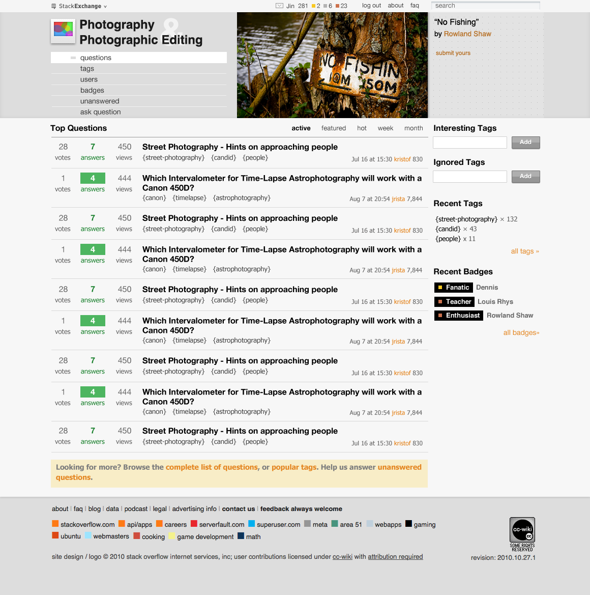
This is a big departure of the "Sketchy" theme you're familiar with, and it's also quite different from the rest of the StackExchange themes I've designed. However, I believe it works well for our Photography site. The body section still has the same structure you're used to. For the header, I made it a bit taller to accommodate for the rotating photo. For this mock up I'm using Rowland Shaw's photo submission. Most elements are reduced to a simple treatment. The overall look and feel I'm going after is an airy and open site, focused on content. A magazine feel, if you will.

For the logo, I decided to use a polaroid pic. I feel it has that timeless look, and is easily recognizable. The square shape also makes a great favicon and apple-touch icon.

Meta Site

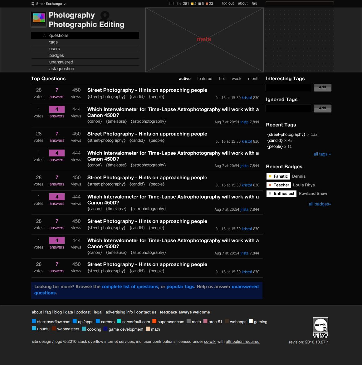
Since the main site is mostly monochromatic, it's a bit challenging to do a Meta site design. Typically the Meta site is a desaturated/grayish version of the parent site. The idea is that it looks distinct from the parent site so there's no confusion as to which site you are on. I thought it might be a good idea to go with something different for Photography Meta site. I think it'd be a clever idea to make the Meta the "negative" version of the parent site, which is a dark theme in this case. I typically don't do dark themes because of readability, but I feel it's a bit safe with the photography crowd as many photography blogs/forums I've seen use a dark theme. Also, this is meta, used by a small group of people.
alt text

note: this Meta mockup is a straight inversion of the parent site. It has some high contrast issues. I will definitely tone it down for the real site implementation in CSS.

Feedback

Please let me know what you think. I feel the design can stand the test of time. It's not based off gimmicks and its simplicity mirrors the essence of photography.

\$\endgroup\$
1
  • 3
    \$\begingroup\$ +1 for minimalism. If you have great content, there's no need to obscure it with a cluttered design. \$\endgroup\$ Commented Oct 28, 2010 at 7:49

7 Answers 7

5
\$\begingroup\$

I definitely like the timeless simplicity, no gimmicks approach. I would definitely like to see less color if possible on the darker site. Love the pro-app style dark grays and blacks.

\$\endgroup\$
2
  • \$\begingroup\$ I definitely will tone down the colors and high contrast of text on the Meta site than in the mockup above. I'm curious, what do you guys think about magenta color for answered/accepted text and box? It's a negative of parent site's green, but I wonder if that's deviating too much from the norm? I feel it works and it's rather self explanatory once people see the negative dark theme. \$\endgroup\$
    – Jin
    Commented Oct 27, 2010 at 23:57
  • \$\begingroup\$ Kind of clever, inversion. I don't see the problem with magenta per se, users who stray onto meta will probably be more hard core and/or already know the SO/SE system. \$\endgroup\$ Commented Oct 28, 2010 at 0:02
3
\$\begingroup\$

I like the looks and I like the rotating image idea, that's a great thought for this kind of site! I'd suggest a weekly thread for the photos though, or the thread is probably going to get quickly out of hand!

\$\endgroup\$
1
  • 1
    \$\begingroup\$ You're right, one master thread would go insane down the road. I've seen it on Flickr forums before.... \$\endgroup\$
    – Jin
    Commented Oct 28, 2010 at 0:16
3
\$\begingroup\$

I personally think the big bar up the top to be cumbersome. The vertical menu "questions, tags etc" menu is unnecessary (make it horizontal).

\$\endgroup\$
3
\$\begingroup\$

I don't think it's a bad design but I'd like to see a bit better use of space and color.

Likes:

  • The user-submitted photo is a great idea and really helps build the community. I know it's quite a bit of effort but if we could get the photo title and subtext to be overlaid on the photo in a minimal but stylish font (think Metro) it would look great.

  • The 'negative' meta page is a great idea.

Dislikes:

  • The fonts. Can we get a stylish modern font on here? I understand there are problems with getting web fonts across all browsers but at the least we should be able to get the logo font updated to reflect the creativity and expression inherent in photography.

  • If we're sticking with a grey theme we should emphasize contrast using light and shadow. Looking at a site like dpreview.com we see that although they have a very flat theme they have a spot of light at the upper left that seems to cast the rest of the site in a shadow. It's subtle but adds to the look. Perhaps the top header could be shadowing the answer section very lightly or something similar.

  • The Ask Question button is not spatially distinct from the other buttons. Asking questions is the most important thing and we want to call out that particular function. Moving it to the right like many of the other sites would help greatly.

  • The top header is too large vertically. I'm not sure yet what the solution could be but it's about 100-150 pixels too large for my tastes. We need to make the questions feature front and center but at the moment when a question page loads the header is featured almost as prominently as the content itself. The eye being lazy is drawn to the dark tones of the header as well and distracts from what is important.

Also as a general suggestion it would be nice if we could incorporate bokeh into the site, perhaps as highlights for answered questions or in the header bar.

edit:

Also as a bug report the 'Flag' button on the meta site opens an almost unreadable window (light gray on white).

\$\endgroup\$
2
\$\begingroup\$

Without specific comments on the proposed designs, I'd like to make a couple more general points.

Photos.se isn't a photography site as such, it's a Q&A site about photography, built on the StackExchange brand.

Joel made the following point in a blog entry

If we launch hundreds of Stack Exchange sites each with their own domain name, there will be no way to distinguish the great Stack Exchange answers from the crappy generic forum answers in search engine results.

I'd argue that while domain names are important for more tech savvy users, the vast majority of the online population would more quickly identify with a look and feel than with the name in the address bar in their browser.

As such, should we be aiming to look like every other photography site, or would a more noble goal be to stand apart from them with a look and feel that's more close to that of the other high quality Q&A sites in the StackExchange brand?

So perhaps the designer's job becomes easier if one abandons the notion that it needs to look like a photography site.

\$\endgroup\$
0
\$\begingroup\$

Seeing the site now, I think the white + dark gray + light gray doesn't work for me as the original screenshots. I liked the subtler header and footer backgrounds (relative to the main background in the middle portion of the page).

\$\endgroup\$
0
\$\begingroup\$

I'm sorry, but I don't like the new design at all. The top bar, especially; it's taking up too much of valuable vertical space. I'm fine with the light gray color background, although I liked the white one better. I'm unable to pin-point what exactly it is, but something is getting in my way in the new design.

I found the previous design the most pleasant of all the Stack Exchange sites. Just my opinion.

\$\endgroup\$

You must log in to answer this question.

Not the answer you're looking for? Browse other questions tagged .