9
\$\begingroup\$

This is the place to submit and vote on photos for the week of 20 June to be featured on the main site. This contest should showcase your best quality work, demonstrating at least moderate skill with a camera and a general understanding of the artistic aspects of photography. Remember, the selected photo will be displayed on our main site header for a week. Submit something that you and the members of our site will want to look at and admire for seven days! Rules:

  • Limit one photo per person per week.
  • A specific photo may be submitted at most two weeks in a row, and not more than four times a year.
  • Keep all images appropriate, we want this site to be work safe.
  • Do not submit a photo if you are currently featured.
  • Images should be 375 x 210 px.
  • Include a title for the image

Feel free to include a link to a larger version of your image.

NOTE: Regarding down votes, don't take them too personally. They are generally indicative of what people want to see on the main page, and you shouldn't read more into votes on these threads than that. A vote generally should NOT be given if an image is improperly sized, just post a comment noting the size discrepancy and allow the submitter to correct.

Voting Closes on June 19th at 11:59pm EDT (UTC-4). Submissions may be added any day of the week until voting closes. The winning image (with the highest votes) as of the close of voting will be exhibited on the main site.

Last week's thread
Winners Hall of Fame

\$\endgroup\$

10 Answers 10

24
\$\begingroup\$

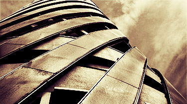
Twist

enter image description here

Larger version here

\$\endgroup\$
22
  • 1
    \$\begingroup\$ Very nice! Not that it matters but what is it? \$\endgroup\$ Commented Jun 15, 2011 at 11:45
  • \$\begingroup\$ A building, a theatre, I believe (just one corner of it). \$\endgroup\$ Commented Jun 15, 2011 at 11:51
  • 1
    \$\begingroup\$ +1 - Nice shot! \$\endgroup\$
    – rfusca
    Commented Jun 15, 2011 at 15:05
  • \$\begingroup\$ Thanks very much. \$\endgroup\$ Commented Jun 15, 2011 at 15:37
  • \$\begingroup\$ saw this and the same moment my mouse went for the up vote :D \$\endgroup\$ Commented Jun 15, 2011 at 17:52
  • \$\begingroup\$ Link to something bigger? \$\endgroup\$ Commented Jun 15, 2011 at 17:55
  • \$\begingroup\$ Edited to include a link to larger. The linked to version is the original, I had to crop it to fit the requirements for here, but I'm not sure if I prefer it cropped now! \$\endgroup\$ Commented Jun 15, 2011 at 18:08
  • \$\begingroup\$ Very dramatic. Love the composition. A bit heavy on the processing, but that's part of what makes it. Great job. \$\endgroup\$
    – jaxxon
    Commented Jun 15, 2011 at 20:56
  • \$\begingroup\$ Thanks. The weather turned overcast about 2 minutes before I got to this spot, the building is covered in some kind of grey metal, the sky was grey, so I had to process it up a bit to give it punch. It kind of gave it a kind of rusty, gritty feel so I went for it. \$\endgroup\$ Commented Jun 15, 2011 at 21:12
  • \$\begingroup\$ What is the "Single... 2011" watermark in the bottom right and right/top/center area? \$\endgroup\$
    – dpollitt
    Commented Jun 15, 2011 at 22:00
  • 1
    \$\begingroup\$ Single Tree 2011... hmm \$\endgroup\$
    – JT.WK
    Commented Jun 16, 2011 at 1:11
  • 1
    \$\begingroup\$ Yeah, I understand wanting a watermark on the larger version but is it needed on this small version? \$\endgroup\$ Commented Jun 16, 2011 at 4:14
  • 1
    \$\begingroup\$ Changed to non-watermarked version. I'd just cropped and shrunk the one already in my gallery, didn't realise it would be so popular. \$\endgroup\$ Commented Jun 16, 2011 at 8:50
  • \$\begingroup\$ You are right it is better cropped. Could you share what technique was used in post processing? \$\endgroup\$ Commented Jun 16, 2011 at 12:33
  • 1
    \$\begingroup\$ Sure. I ramped up the sharpening and contrast in Adobe Camera Raw first, then in PS I converted it to black and white using Image > Calculations, then used the technique I described in this question: photo.stackexchange.com/questions/12836/… to apply the colouration. I made two of those Curve Adjustment Layers and set them both to Overlay which boosts the contrast massively. I masked the sky so I could adjust it separately from the building. Smart Sharpen quite aggressively to finish. \$\endgroup\$ Commented Jun 16, 2011 at 13:02
10
\$\begingroup\$

Life

enter image description here

This photo was selected as Official Wallpaper in Ubuntu 10.10...

\$\endgroup\$
6
  • 2
    \$\begingroup\$ I can imagine that this probably made a halfway decent full-sized wallpaper, but the the dimensions it has to be here on photo-SE makes it seem really busy/cluttered and that doesn't really do it any favors... \$\endgroup\$ Commented Jun 15, 2011 at 1:43
  • 1
    \$\begingroup\$ wasn't this photo already submitted a few weeks ago? \$\endgroup\$ Commented Jun 15, 2011 at 2:07
  • 1
    \$\begingroup\$ @Jakub: It's within the rules: "A specific photo may be submitted at most two weeks in a row, and not more than four times a year." \$\endgroup\$ Commented Jun 15, 2011 at 2:20
  • \$\begingroup\$ my sincere apologies... \$\endgroup\$ Commented Jun 15, 2011 at 2:25
  • 1
    \$\begingroup\$ this is very.... well... wallpapery :D \$\endgroup\$ Commented Jun 15, 2011 at 17:52
  • 1
    \$\begingroup\$ I actually kinda like it. Yes, it's wallpaper-y/stock-y but it's compositionally strong and draws the eye in with texture and form. Great processing, too. EDIT:spelling \$\endgroup\$
    – jaxxon
    Commented Jun 15, 2011 at 20:59
9
\$\begingroup\$

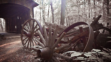
A Bridge Too Far

A Bridge Too Far

This wagon and covered bridge are on the grounds of a Boy Scout camp an hour or so East of Columbus, OH. It's been there for years, but I've never taken the time to go out there and get any photos. I got some other photos of the wagon alone, but I like it with the bridge in the background, even though I was fighting the morning sun behind it.

Canon 40D; 17-85 f/4-5.6. More from this campout can be seen here.

\$\endgroup\$
3
  • 1
    \$\begingroup\$ very nice for such a small crop \$\endgroup\$
    – dpollitt
    Commented Jun 15, 2011 at 1:52
  • \$\begingroup\$ Thanks - I went a little heavy on sharpening, hoping it would help when downsized. The reds in the rusted wheels & bearings don't show up very well in this size, though -- it looks like plain sepia. I've done this with a couple other "rusty" pictures, and I sort of like the look. \$\endgroup\$
    – D. Lambert
    Commented Jun 15, 2011 at 2:01
  • 1
    \$\begingroup\$ I really liked the shot, it carries some history with it. \$\endgroup\$
    – Joanne C
    Commented Jun 15, 2011 at 3:21
8
\$\begingroup\$

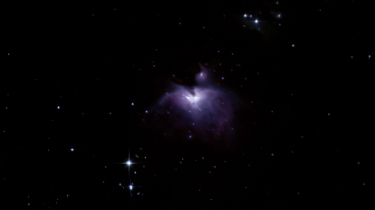
Orion's Nebula

enter image description here

Something a little different this week. Haven't seen any astrophotography represented yet.

\$\endgroup\$
11
  • \$\begingroup\$ Got a larger shot? \$\endgroup\$
    – Joanne C
    Commented Jun 15, 2011 at 0:26
  • \$\begingroup\$ JoanneC: rfusca.smugmug.com/Other/Astro/16498667_siG6h#1241752856_UA3uL I'm hoping in the next couple of months to get a better shot of it. \$\endgroup\$
    – rfusca
    Commented Jun 15, 2011 at 0:28
  • 1
    \$\begingroup\$ Nice shot - did you consider a tighter crop for the banner picture? \$\endgroup\$
    – D. Lambert
    Commented Jun 15, 2011 at 1:17
  • \$\begingroup\$ how long was this exposure? \$\endgroup\$
    – dpollitt
    Commented Jun 15, 2011 at 1:53
  • \$\begingroup\$ @D. Lambert - its already up so I won't change it now - but a tighter crop may work. It was already a huge crop from a 300mm shot. \$\endgroup\$
    – rfusca
    Commented Jun 15, 2011 at 2:50
  • \$\begingroup\$ @dpollitt - it was like 30-40 stacked of a like 8-10 second exposure. It needed to be that many stacks but like a 5 minute exposure once I finally finisher my tracker. \$\endgroup\$
    – rfusca
    Commented Jun 15, 2011 at 2:51
  • \$\begingroup\$ A K-5 or K-r with the new GPS attachment may then be beckoning I suspect... I like the shot and I hope to do something like that this summer. \$\endgroup\$
    – Joanne C
    Commented Jun 15, 2011 at 3:19
  • \$\begingroup\$ JoanneC: I think you said you preordered that? - so I'm awaiting your judgement and then we'll see if it ends up on the Christmas list. K-5 or K-r will be happening by week end. \$\endgroup\$
    – rfusca
    Commented Jun 15, 2011 at 3:27
  • \$\begingroup\$ I have, I expect mid to late July, but I hope before I'm going north in July. Either way, I'll fill you in. :) \$\endgroup\$
    – Joanne C
    Commented Jun 15, 2011 at 3:29
  • 1
    \$\begingroup\$ those sparkles look unreal! \$\endgroup\$ Commented Jun 15, 2011 at 8:44
  • \$\begingroup\$ @ShutterBug - the sparkles are real, but enhanced. \$\endgroup\$
    – rfusca
    Commented Jun 16, 2011 at 15:17
4
\$\begingroup\$

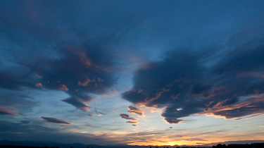
Summer Sunset

enter image description here

The first awe-inspiring sunset of the Colorado summer.

Canon 450D
Canon EF 16-35mm L II
1/200 @ f/10 & ISO 800

\$\endgroup\$
5
  • 3
    \$\begingroup\$ I would prefer slightly more ground/mountain in this \$\endgroup\$
    – dpollitt
    Commented Jun 15, 2011 at 1:52
  • \$\begingroup\$ Me too...sadly, its all city, streets, and homes instead. :( \$\endgroup\$
    – jrista Mod
    Commented Jun 15, 2011 at 1:53
  • 1
    \$\begingroup\$ Still .. a little more context would be welcome. Even if it's of urban life. :) Phenomenal sky, though! \$\endgroup\$
    – jaxxon
    Commented Jun 15, 2011 at 20:58
  • \$\begingroup\$ The foreground really didn't add much of anything. It was all dark, black with the car lights here or there, with random city lights winking on everywhere. But it was a very wide angle shot, so none of it would have been distinct, and none of it would have been much more than just noise that detracted from the sky. The consequences of having a day job, 45-60 minutes away, in the middle of a city. :\ \$\endgroup\$
    – jrista Mod
    Commented Jun 16, 2011 at 1:39
  • \$\begingroup\$ +1 for "Hey! That be real purrrdy!" ;-) \$\endgroup\$ Commented Jun 17, 2011 at 18:23
3
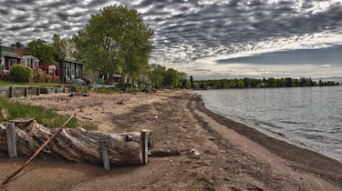
\$\begingroup\$

Sunbathing

Sunbathing

\$\endgroup\$
1
  • 1
    \$\begingroup\$ Gosh, how I wish I were that dog right now. \$\endgroup\$
    – blubb
    Commented Jun 16, 2011 at 8:47
3
\$\begingroup\$

Sunday at Camp

enter image description here

Canon 60D, 18 mm, f/16.0, ISO 100, HDR processing with Nik HDR Efex Pro (3 shots -2ev, 0ev, and +2ev)

see it on Flickr

\$\endgroup\$
3
  • \$\begingroup\$ The sky somehow doesn't look natural to me. \$\endgroup\$ Commented Jun 18, 2011 at 4:08
  • 2
    \$\begingroup\$ I didn't want it to look natural. HDR often yields an unrealistic look. \$\endgroup\$ Commented Jun 18, 2011 at 4:44
  • \$\begingroup\$ I feel good on reading an honest reply :) \$\endgroup\$ Commented Jun 18, 2011 at 5:35
-2
\$\begingroup\$

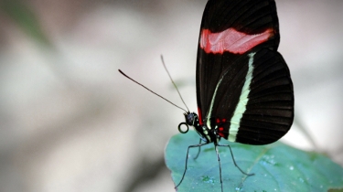
Glimpse of Peace

Glimpse of Peace

Taken in a indoor zoo specializing on butterflies.

Large version

\$\endgroup\$
7
  • 1
    \$\begingroup\$ IMO, the wing of the butterfly shouldn't have been cut off. \$\endgroup\$ Commented Jun 16, 2011 at 6:33
  • \$\begingroup\$ @Anisha Kaul: I agree, but it's a compromise I had to make in order to adhere to the wide format while still being able to show sufficient amount of detail :( \$\endgroup\$
    – blubb
    Commented Jun 16, 2011 at 7:04
  • \$\begingroup\$ I would have taken this photograph by holding the camera vertically. \$\endgroup\$ Commented Jun 16, 2011 at 7:49
  • 3
    \$\begingroup\$ @Anisha Kaul: Unfortunately, that doesn't help if the image must be exactly 375x210. \$\endgroup\$
    – blubb
    Commented Jun 16, 2011 at 8:14
  • \$\begingroup\$ Oh, I thought one can take a large resolution photograph as desired and then save it as a low resolution photograph. \$\endgroup\$ Commented Jun 16, 2011 at 8:33
  • 1
    \$\begingroup\$ @Anisha you can, but the resolution isn't the problem, it's the aspect ratio. (see the higher res version Simon linked to.) To fit the entire (tall) wing in the allotted space you would have to pull back to the point where the butterfly would be tiny. \$\endgroup\$
    – cabbey
    Commented Jun 19, 2011 at 23:06
  • \$\begingroup\$ Then this probably isn't a great choice for this contest... \$\endgroup\$
    – jaxxon
    Commented Jun 20, 2011 at 5:03
-3
\$\begingroup\$

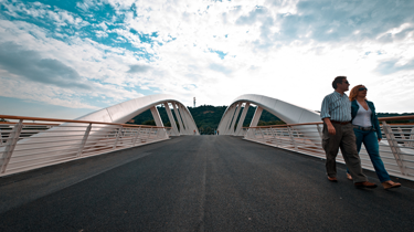
"Ponte della musica" (Bridge of Music)

enter image description here

Original on Flickr.

\$\endgroup\$
9
  • 2
    \$\begingroup\$ I would love this...without the people there. \$\endgroup\$
    – rfusca
    Commented Jun 13, 2011 at 19:16
  • 3
    \$\begingroup\$ it would be boring... wouldn't it? \$\endgroup\$
    – friol
    Commented Jun 13, 2011 at 20:59
  • \$\begingroup\$ Maybe, I don't know...but the people look like they're invading would should be an architectural photo. \$\endgroup\$
    – rfusca
    Commented Jun 13, 2011 at 21:06
  • \$\begingroup\$ Have to agree with rfusca on this one. The people don't really bring an intriguing element, and as they are walking out of the frame, it seems a little odd. In this case, I think the bridge alone would be better. There are some other issues with the photo as well...such as the severely blown out clouds. Artistically, I might have chosen an angled view of the bridge from the side, or maybe a black and white version. Something to make it more interesting and more stylistic. \$\endgroup\$
    – jrista Mod
    Commented Jun 13, 2011 at 21:22
  • 6
    \$\begingroup\$ I have to agree in theory. If they were walking into the frame (away from the camera across the bridge), it might draw the eye into the photo. As it is, it carries the eye away from the focal point, which feels odd. Nice feel to the architecture and sky, though. But it's your photo. If you like it, that's what counts! \$\endgroup\$
    – jaxxon
    Commented Jun 13, 2011 at 23:17
  • \$\begingroup\$ Ok... the seagull wins :-) \$\endgroup\$
    – friol
    Commented Jun 14, 2011 at 17:19
  • 3
    \$\begingroup\$ -1 for the last comment \$\endgroup\$ Commented Jun 14, 2011 at 19:08
  • \$\begingroup\$ Ppl, this is not a photo about architecture. This is about flow, life, time, walking together on a bridge... It's asymmetric on purpose. \$\endgroup\$
    – friol
    Commented Jun 17, 2011 at 17:46
  • \$\begingroup\$ @Friol Completely OK (potentially healthy, even!) to like your own picture even if others don't like it, or don't 'get it.' In the picture-of-the-week threads especially it's a good idea not to weigh downvotes- or even peoples comments- too heavily... They're far from a 'formal critique.' :-) \$\endgroup\$ Commented Jun 18, 2011 at 3:16
-3
\$\begingroup\$

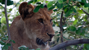
Hungry

Tanzania Lion in tree

Taken in Tanzania in November.

Canon 30D, EF 70-300 f/4-5.6 @ 300mm, 1/250 sec @ f/5.6, ISO 400

Larger

\$\endgroup\$
9
  • \$\begingroup\$ can you add a link to a high resolution version? Is this the "L" series version of the lens? \$\endgroup\$ Commented Jun 14, 2011 at 19:11
  • \$\begingroup\$ Was just in the process of uploading the larger version. I wish I had L glass, unfortunately this was not shot on the L version of the lens. \$\endgroup\$ Commented Jun 14, 2011 at 19:29
  • \$\begingroup\$ Anyone got critiques on the image? Feel the -3 is a bit harsh. \$\endgroup\$ Commented Jun 15, 2011 at 14:08
  • 1
    \$\begingroup\$ just made it -2 from -3, I liked it... :D \$\endgroup\$ Commented Jun 15, 2011 at 17:50
  • 7
    \$\begingroup\$ @Vian: This is at best a 'snapshot' quality image... It appears that (aside from the crop) this is right out of the camera with no post-production work. You've done nothing to help the subject stand out amongst a lot of busy background/foreground elements, overall the colors are dull, and the subjects eyes aren't bright so it appears lifeless. Ultimately there's nothing to draw the eye in, and nothing to direct the eye in the frame... It is, well, a snapshot. For those reasons I don't think that -3 is harsh at all... \$\endgroup\$ Commented Jun 15, 2011 at 18:07
  • \$\begingroup\$ @shutterbug Thank you :) It's not that I'm upset about rating, but thanks for the +1. I just wanted to get some feedback on why people were so against having it as featured image. After seeing the latest submissions it didn't stand a chance anyway. Just trying to learn. I actually got almost identical feedback on Photo.net as Jay gave. \$\endgroup\$ Commented Jun 15, 2011 at 20:55
  • 3
    \$\begingroup\$ Genearally agree w/ @jaylance . . the exposure seems off as well. Blown highlights and low-contrast/desaturated mids and blown (is that the word?) shadows. Agree that a little post-production love would help this photo a lot. Compositionally, I like that there's space to the right where the lion is looking.. but the foreground branch and the bright spots in the background are distracting. Hope this helps. \$\endgroup\$
    – jaxxon
    Commented Jun 15, 2011 at 21:03
  • \$\begingroup\$ @Vian Though I am NOT an expert photographer, but still I find the photo to be cluttered (with leaves) and too tightly framed. \$\endgroup\$ Commented Jun 17, 2011 at 10:08
  • \$\begingroup\$ While I like the composition, to me the biggest missing factor is the white balance. If this was pulled warmer it would make a huge difference. As others have stated, it also is too dark and could use exposure compensation. I wish I had a lion to photograph, looks fun! \$\endgroup\$
    – dpollitt
    Commented Jun 17, 2011 at 17:56

You must log in to answer this question.

Not the answer you're looking for? Browse other questions tagged .